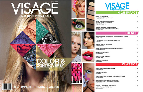
My goal for my table of contents is something simple but still aesthetically pleasing.
I'm worried that if I do something too abstract for my table of contents, would look too confusing.
So, I did some research and here is what I found:
By using gradients in magazine design it not only creates intrigue but it creates a calming effect.
I think that I can use a gradient for my Table of Contents but I want to add pictures to my magazine. Pictures give more background as to what I will mention in my fashion magazine.
I also found another magazine that uses tabs to organize the Table of Contents into separate sections. I thought that this was a creative idea but I don’t think it would be a viable idea for my magazine. Although, I could color code my magazine according to sections like fashion and trends, beauty, tips, and current events. I also plan on adding subtitles to each section but I am not sure what they will be yet. Something to think about...

 Another method I can use is making a background with expressive typography. I want to have a mix of splatter paint and this font because I think that using this type of font will attract readers.

I also liked layouts that integrated text into the images. I thought this was a dynamic way to integrate text into the information for the Table of Contents.
All in all, I think that I need to more research on TOC Layouts before I decided on my final one.
Expect updates!!
Stay weird :)
Alexa
Reference:
Jose, Maria. “Designing the Perfect Table of Contents: 50 Examples to Show You How – Learn.” About Canva, Canva, 28 Oct. 2018, www.canva.com/learn/table-of-contents-design/.

.jpg)


No comments:
Post a Comment